
Everyone agrees there are plenty of data visualization libraries available, yet most web developers still choose the incorrect one. It’s not that web developers don’t know what they’re doing, but the problem is that these libraries are not built for the same purpose. Popular lists of data visualization libraries lump them all into one, so it’s hard to tell what each tool really does.
D3, Highcharts, and GPU-accelerated engines solve fundamentally different problems, as one gives you low-level SVG control, another ships React components out of the box, and the third renders millions of data points at 60 FPS. You can’t really compare them because they don’t solve the same problem.
Picking a library based on GitHub stars or the number of tutorials written about it doesn’t tell you that your dashboards might slow down when you connect real-time data streams, that your chart rendering breaks when you try to swap your app’s framework, or that the charts fail an accessibility audit for screen reader support. Most data visualization library lists don’t differentiate between data visualization tools that are meant to be used by developers. Instead, all these tools sit side by side as equal contenders.
This guide, however, separates them and ranks the top data visualization libraries. We compared them on what matters: how well they perform at rendering large datasets, what frameworks they support, how many chart types they support, how active the project is, and how mobile-friendly their charts are.
Here’s a snapshot of the key differentiating factors among the top 11 data visualization libraries.
Top 11 Data Visualization Libraries
Data visualization libraries come in all shapes and sizes. Some prioritize raw performance, others focus on ease of use, and a few try to cover every chart type imaginable. Here are eleven of the best options available, starting with the one that handles the heaviest data loads.
Highcharts
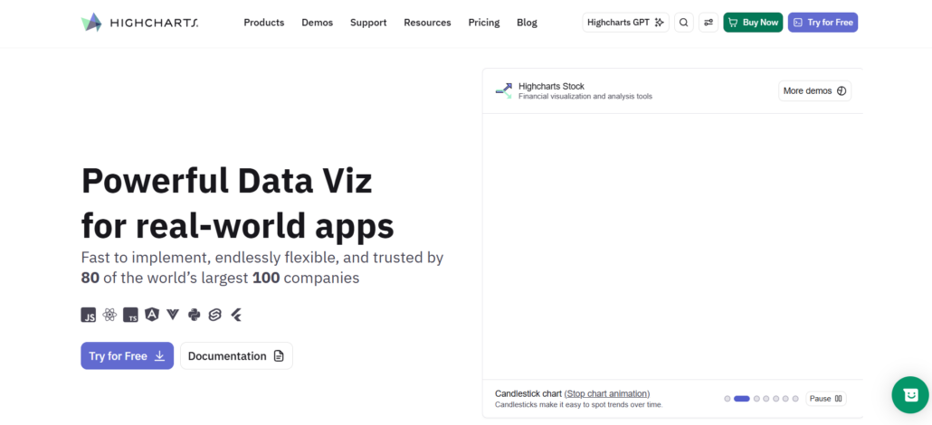
In total, Highcharts provides:
- Core
- Stock
- Maps
- Gantt
- Grid
- Dashboards
So you don’t need to worry about connecting various libraries to get the full charting experience. The team at Highcharts has also done a great job considering how important accessibility is for apps, and they have also made every API and feature decision based on the real-world requirements of an app.
From ensuring ARIA compliance when it comes to chart markup to making sure the charts automatically respond to different mobile viewports. It is built for real apps, not for just making charts.
Highcharts can easily be added to React. There are no extra steps needed when it comes to ensuring Highcharts compatibility for your app.
Highcharts support and reliability have always been a priority. It is important to ensure that Highcharts is built so it can run on large-scale apps without any issues. It is also mission-driven and focuses on building the right solutions for the long time in the future to support all kinds of apps and chart requirements.
SciChart
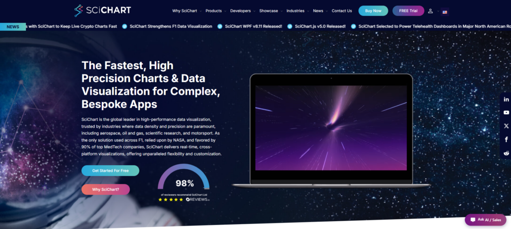
For applications where every frame of responsiveness counts, SciChart is the tool to reach for, shipping with a proprietary, Vx™ GPU-accelerated render engine capable of rendering hundreds of millions of datapoints on the browser at 60 FPS, an order of magnitude more than any Canvas or SVG library can handle for the same set of data.
Built in 2012 to provide top-notch speed in any charting use case, SciChart has a huge ecosystem of financial, scientific, and live data visualizations in which the platform’s interactivity shines when handling extreme datasets.
SciChart also supports WPF, JavaScript/React, iOS, Android, and macOS charts, so teams can share the same charting logic with web and native apps across the board. SciChart has an expansive charting toolkit, from 2D to 3D, Geo Maps, Gauges, Polar Charts, and Heatmaps, and it offers a flexible API with many options for deep customization.
SciChart might not have quite as easy a learning curve as the declarative component libraries do, but when you get beyond 10,000 datapoints per series, the investment is worth it for the performance ceiling.
Highlights:
- Renders hundreds of millions of datapoints on the browser at 60 FPS
- Expansive charting toolkit, from 2D to 3D, Geo Maps, Gauges, Polar Charts, and Heatmaps
- Flexible API with many options for deep customization
- Nearly 500 five-star reviews on Reviews.io
- 170+ demos, detailed documentation, and a built-in AI assistant
Apache ECharts
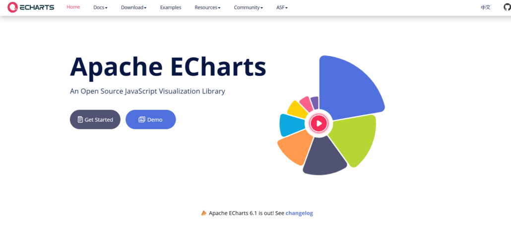
Because of its wide variety of charts, it is a great choice for open-source use. It started in 2012 and is backed by the Apache Software Foundation, suggesting long-term sustainability and a community-driven development roadmap as opposed to a single-company roadmap.
It comes with 20+ chart types built in and supports both Canvas and SVG rendering, depending on the size of your data set and browser support.
It also performs well with large data sets using progressive rendering to avoid UI freezes on large historical data or real-time data feeds. It has been used by China’s biggest web companies for years, and now in the US and the world too. It is open source under the Apache license, meaning it’s free even for commercial use.
Recharts
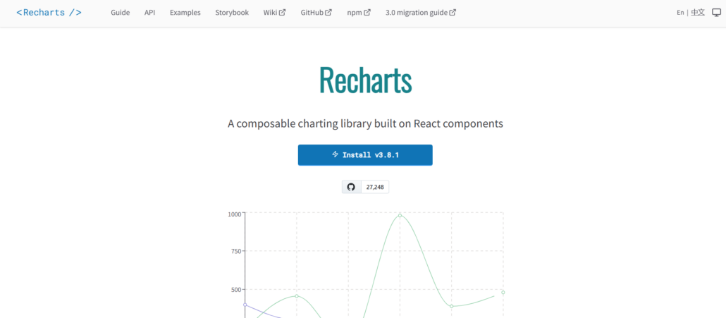
However, for React developers, Recharts presents an alternative to D3. Recharts is an assortment of composable React components, where you build charts compositionally. There’s no imperative, low-level D3 code.
Started in 2015 as a library specifically for React developers, you import a <LineChart> or <BarChart> to your React project and render. The library uses composable SVG-based components, with minimal D3 dependencies, to provide the power of D3’s scales and shapes without the boilerplate of D3 selections or enter-update-exit.
Each chart in Recharts is an independently composed component, so building charts that fit into a responsive design pattern is built-in. You have no problems using Recharts in a standard React project, passing data down and rendering a chart in the component hierarchy. You can easily use components like <Tooltip>, <Legend>, and <CartesianGrid> in your chart’s markup.
The best use case is in a React project where you need charts and don’t want to spend time building your own from scratch.
ApexCharts
ApexCharts offers ready-to-use integration with React, Angular, Vue, and Blazor that demands little configuration, making it a sensible pick for teams deploying dashboards on a variety of frontend technologies. It’s only been around since 2018, but it has quickly become popular thanks to its focus on usability and documentation rather than maximum performance.
The library’s scale includes over 20 chart types, plus built-in zoom, pan, and annotation capabilities, so you won’t need to build your own user interactions or search outside for plugins when users ask for standard features like drill-down or time-series brushing.
It’s a no-brainer for rapid prototyping or internal use cases where quick integration is more important than the need to render thousands or millions of data points.
If you’re working with React, Angular, or Vue and want to quickly get ApexCharts.js up and running in your component architecture, you don’t have to alter your state management or deal with D3’s imperative bindings.
amCharts
amCharts prioritizes chart variety over framework optimization. With 60+ chart types, including financial and Gantt, it’s a solid choice for teams that need broad coverage without building everything from scratch.
Launched in 2006 and trusted by over 20,000 companies, the library has benefited from two decades of refinement. It uses Canvas rendering, which delivers better performance than SVG for complex datasets.
amCharts is the go-to choice for teams that want variety without complexity. The library includes financial, Gantt, and map charts natively, eliminating the need to integrate separate packages. The main advantages:
- Canvas-based rendering handles complex interactions better than SVG
- Smooth performance for hundreds of data points
- More chart types than any other library on this list
- GPU acceleration only matters for edge cases—most dashboards won’t notice the difference
ZingChart
Established in 2009, ZingChart delivers itself as unadulterated JavaScript, unencumbered by any dependencies, thus enabling effortless integration into both ancient codebases and current SPA’s without any struggle with framework adapters. It ships with 50+ chart types out of the box—line, area, scatter, heatmaps, Gantt, treemaps, and gauges—all through a single API with no build tools required.
When you deal with datasets ranging between 10,000 and 100,000 records, and your data updates in real-time with a period of just a few seconds, you’ll be surprised to note that, given the use of Canvas-based rendering and a throttled update system, your data will not lose its crispness on the display.
Even so, your declaratively formatted configuration would still remain at the heart of simplicity, as you’ll have to deal with it while incorporating annotations, a zoom control, and custom tooltips, all along multiple data series, on the screen of the real-time dashboard.
CanvasJS
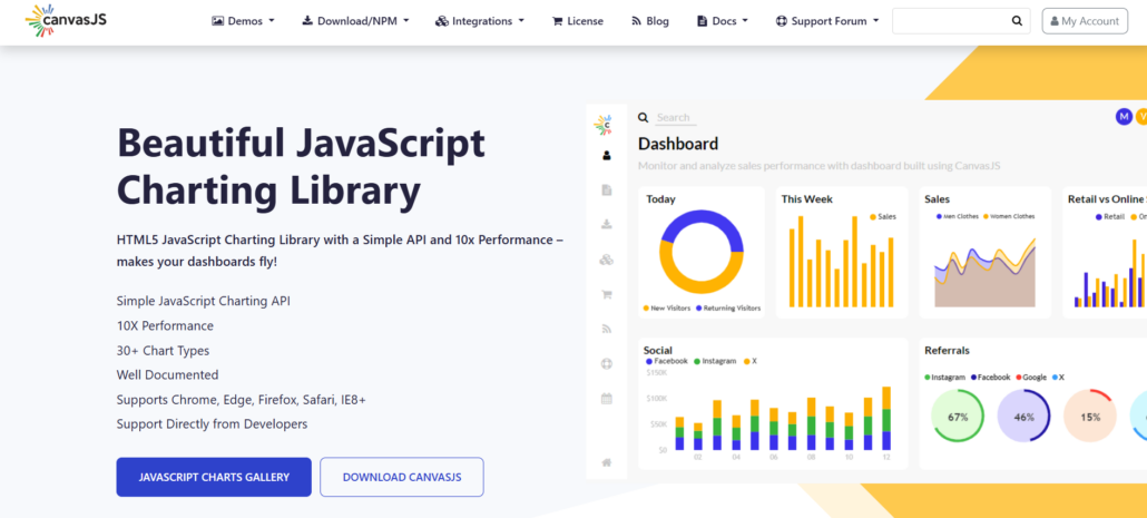
The feature set of CanvasJS is very minimal. The charts are rendered using a Canvas element rather than an SVG element, which means that they are faster in terms of their refresh speed, and you shouldn’t be relying on vector graphics. The library does not have any external dependencies, and that means fast load time and less chance of conflict with other libraries when you’re upgrading or refactoring code.
The charts also work responsively, so you should not have to add any breakpoints. This means it is easier to add chart elements to your dashboard pages. The chart types supported include:
- line chart
- bar chart
- pie chart
- area chart
This covers all the most basic requirements. However, if you need very quick rendering, such as in the case of a real-time data feed or a stock market ticker, you would probably want to use CanvasJS to avoid the slowness of other chart elements.
D3 by Observable
D3 hasn’t changed much since it was created in 2011, but for developers wanting total control over every pixel of their visualization, it’s still the best choice. Rather than providing pre-styled components with your charts, D3 links your data directly to the DOM, SVG, and Canvas.
This makes it very easy to create visualizations that aren’t available with charting component libraries, and it’s still the standard library used to create custom data visualizations for newsrooms and researchers.
Because it also has a rich animation and transition library, it’s easy to create animations that can be used to tell a story. These can include morphing shapes, coordinated updates to multiple views, and physics-based layouts that are very difficult or impossible to do in component libraries.
Although the learning curve is steep, D3 is fully open source and very flexible, which makes it the perfect choice for teams with JavaScript experience who want complete freedom to create their own visualizations.
Plotly
Plotly provides open-source graphing libraries, including Dash, to help teams build complete data apps. The library is available in Python, R, and JavaScript, and you can prototype in notebooks before deploying live dashboards without leaving.
AI-native analytics in Plotly Studio lets you quickly do exploratory analytics while publishing via Plotly Cloud, and Dash Enterprise on-premise covers both the SaaS and on-premise use cases. Stability in visualizations ensures that you don’t have any unexpected issues in production.
The charts are converted to an interactive app via the framework called Dash, which includes callbacks and state. This can be used for teams that need to iterate fast without creating a new layout logic from scratch.
Fusioncharts
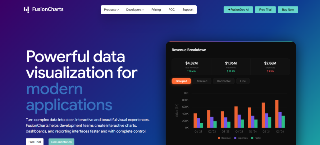
Fusioncharts provides 95+ chart types, 1400+ maps, and 20+ dashboards out of the box, which makes it the most feature-rich visualization library in this list.
This chart library is ideal for teams that build enterprise dashboards, as they don’t need to spend time on configurations; all they have to do is integrate the library components, bind the data, and render beautiful charts. React or Angular integration provides smooth integration of charts to any React or Angular-based application.
Fusioncharts works across technologies and environments: teams can implement it even in older jQuery applications and the latest TypeScript single-page applications. However, as this chart library provides a lot of features out of the box, it weighs heavily and is not recommended if teams plan to build GPU-accelerated real-time dashboards. In that case, teams can go with libraries like SciChart or ECharts.
Conclusion
Different visualization tools are best suited for different use cases. Are you trying to prioritize raw render speed? Do you care more about the speed of integration with your existing framework? Or do you want deep customization? This article will help you to identify the use case that each library excels in.
First, decide on the scale of your data. If you are working with millions of data points and need live visualizations, you need a library with GPU-accelerated rendering. If you are a React developer and want to build dashboards quickly, then component libraries are the way to go. You should still run a few PoCs with the leading three libraries in your category before committing to a yearly subscription.